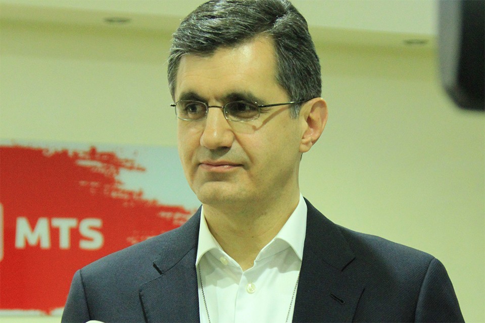
Viva-MTS has started a process to restyle the corporate logo. The news was announced on Facebook by the General Manager of the Company Ralph Yirikian.
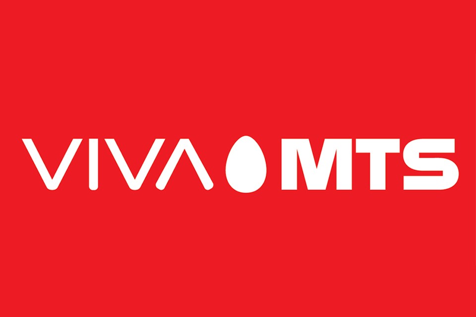
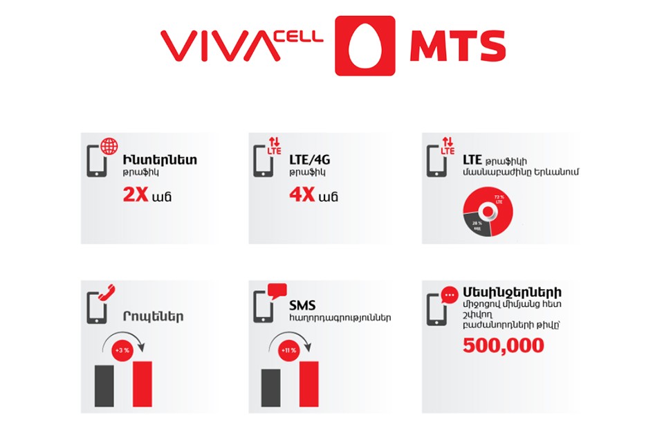
Thus, the elements of the logo are changed. The element “Cell” will be left out of the new version, with only the “Viva” and “MTS” kept as part of the logo. The changes reflect the Company’s new strategy aimed at development of digital products and services. In line with this approach, the graphical design of the element “Viva” will also be changed.
“We change the logo of our Company. After all, the logo should convey what the company does, it should match the identity of the company,” Viva-MTS General Manager Ralph Yirikian said.
The style change of the logo also emphasizes the strategic orientation of the Company towards youth and the digital world: colorful, bold, and cheerful.
“Viva, which has been so dear to our hearts for many years, the foundation and symbol of our identity has remained unchanged. “Cell”, besides its main meaning, symbolizes mobile communication services, that is, what we have always provided. Thus, while continuing to provide telecommunications services, we are growing into a digital company that provides a variety of services,” Yirikian clarified.
The changes are intended to underline that today Viva-MTS markets more than just voice and data transfer services, including a number of gaming, entertainment, and educational applications, electronic wallet, mobile television, cloud services, useful solutions for effective business and financial management, and more.
Viva-MTS is currently undergoing a transformation from a telecommunications operator to a comprehensive digital services company. According to the Company’s General Director, this is in line with global trends in the sector, as well as the growing needs and expectations of subscribers who want to see the Company being more than a telecommunications operator.

17:29 | 24.09.25 | Articles
Jacopo Losso on Cross-Border Investments and Why Armenia Attracts Angels

